Inthegreen asked about ABDC & I posted a thumb for him. Kenm recently provided a link to a data table comparing the entire BDC universe (52 BDC’s) (http://cefdata.com/bdc/). When error checking the RIP spreadsheet, I used this list to run through all 52 through and see what Miller might think of them. In 2 words, not much. It seems just about all of them are overpriced and at risk of cutting dividends, according to his criteria. Remember, Miller’s criteria are used to search for companies that have a long history of paying dividends and increasing them over time, so it is no surprise that almost all of these fail in this part of the cycle... Even one of our board favorites, MAIN, doesn’t get much respect. That doesn’t mean some of these might not be good investments for those who want to do deeper research & maybe trade a little, but for dividend safety hounds, like myself….. Not interested right now. Remember, these are Miller’s screens, not mine, although I tend to like them.
Disclosure: I own MAIN and PFLT, but purchased them months ago during the Jan/Feb interest rate panic. They have both done quite well for me since then. I am comfortable continuing to hold them.
Here’s the comparison list, sorted by Dividend Safety Score. (I’ve changed the screen shots so the table is broken into 2 parts so it should be easier to read.)
*Note: The column values are cryptic and hard to understand. Definitions and explanations are at the bottom of this post. Happy hunting and good luck.
**Note: The MaxDD script had an error & I had to erase the values. The script has been fixed, but I didn’t feel like repeating the screen 52 times again, so the field is blank.
Left side of table:

Right side of table with ticker column repeated:
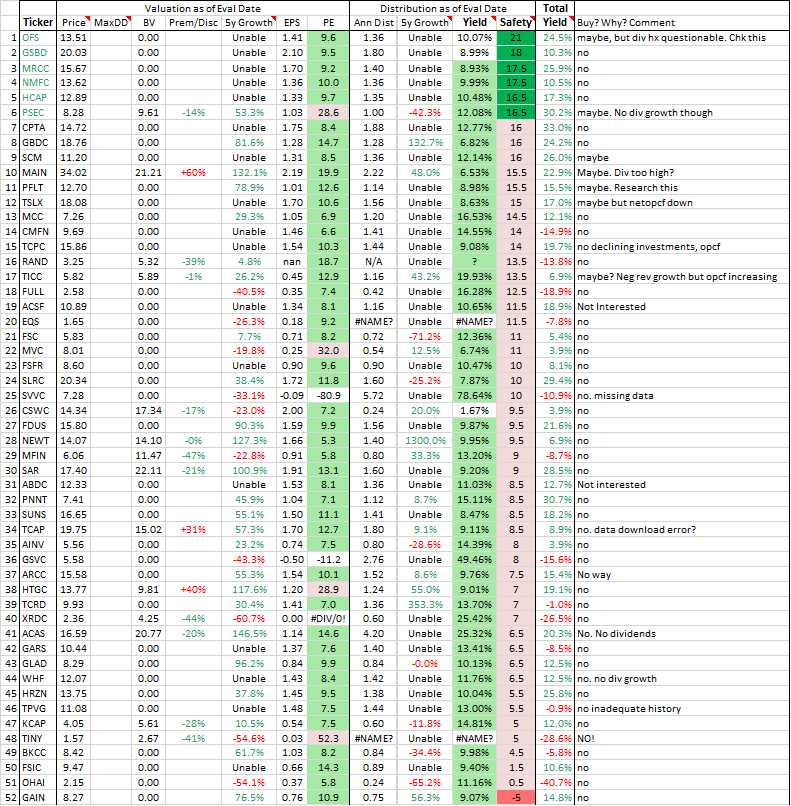
Explanation of table entries:
RIP Screening for the Bruce Miller guided Income-Only portfolio
From Miller: Growth in revenue by itself is not adequate to show a healthy company. It must be translated into growing Net Operating Cash Flow. Consistently increasing Revenue & Net OpCF is a measure of management's ability to translate increased revenue into dividends. Dividends should come from OpCF. In bad years, some companies may pay some of the dividend from bonds, selling assets, or new equity (termed return of capital). This is a bad sign, but is sometimes necessary. Shareholder equity will decline if this is happening.
Change in Revenue & Net OpCF:
The last 5 year’s year-end and TTM Revenue & Net OpCF Values come from the company's Income and Cash Flow statements (copied from Morningstar), respectively, and are translated into a single value:
2+ means company increased Rev in 2/5 years with the last year being + growth
2- means company increased Rev in 2/5 years but the last year was not greater than the previous year
The best result here would be 5+ meaning Rev consistently increasing
The worst would be 0- meaning Rev is consistently declining
Interest to Net OpCF:
This is calculated from the "Interest Expense" obtained from the company’s Income Statement (copied from Morningstar). It is the fraction of Net OpCF dedicated to paying off debt. Debt service should be <30% for utilities and <50% for most others.
Dividend to Net OpCF: This is calculated from the “Dividends” or “Dividends Paid” value obtained from the company’s Cash Flow Statement (copied from Morningstar). It could be considered a payout ratio. Utes are usually <50%. MLPs and REITs should be <80%. Anything above should be concerning.
Growth of Revenue:
Miller calls this “ROIC Revenue” or “Revenue for ROIC”. It’s actually a 3-5 year average annualized measure of revenue growth. Values less than 2% indicate the company may be struggling to increase cash flow from operations. A bad year here or there may be OK, depending on what explains the growth failure. Values less than 1% are a clear danger sign. Really high values usually reflect missing or absent Investment data for one or more years.
Growth of Net OpCF:
Miller calls this "Net OpCF ROIC" or "ROIC for Net OpCF". It’s actually a 3-5 year average annualized measure the company's cash flow growth. A rising Net OpCF from year to year is a sign the company may increase its dividend. A falling value makes a dividend increase unlikely. A bad year here or there may be OK, depending on what explains the growth failure. A value <2% means the company is struggling to increase Net OpCF and <1% is a clear danger sign.
Change in Equity:
Gradually rising equity is a good sign and declining equity is bad. The Shareholder Equity value comes directly from the company’s Balance Sheet (copied from Morningstar) and is translated into a single value on the comparison table:
2+ means company increased Shareholder Equity in 2/5 years with the last year being + growth
2- means company increased Shareholder Equity in 2/5 years but the last year was not greater than the previous year
The best result would be 5+ meaning Shareholder Equity has consistently increased for 5 years.
Safety Score:
An attempt to put dividend safety into one number generated from an individual stock's financial evaluation. It’s a summation of changes in revenue, cash flow, equity and growth. Positive growth increases the value and negative growth decreases it. The result is a single number between -13.5 to max 27, with higher numbers indicating higher dividend safety. Values above 16 appear green. Anything below that probably has too many problems to be considered. It is not tabulated for ETFs, CEFs or mutual funds - only stocks.